Welcome to this week’s Saved Spaces! I’m absolutely loving this series so far. It’s fun to go back through my Pinterest boards and see the inspiration I’ve saved over the last week or so. I also have the best time hunting down similar products to recreate a look with – it’s like a treasure hunt!
This week, my obsession with black and white floors continues, and I’ve also found a new way to hang an accent light that I’m definitely going to integrate into our home somewhere. I hope you enjoy! x
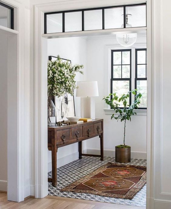
Anderson Wier Studio, The Palisades
I’m not even sure where to start! I love everything in this space. I was instantly smitten with this vintage console and the hardware detailing. Also, if you read the previous Saved Spaces, you know I’m a sucker for a black and white tile floor. I love the unique pattern of this one. It is an unexpected element but really brings the small entryway to life. Partnered with copper and vintage accents, it’s such a happy welcome into the home. Taking mental notes if I ever have an entryway!
get the look


STADT Architecture, Chelsea Pied-à-Terre Apartment
I can’t pinpoint exactly what drew me into this space initially, but after viewing the whole apartment, I became obsessed! This space feels so warm and inviting, even though it is fairly stark and minimal. The warm wood tones and cream upholstered seating contrasted to the more modern kitchen make it feel welcoming. Also completely in love with the pendant light fixture – finding somewhere to have a wall mounted pendant like this asap!
get the look
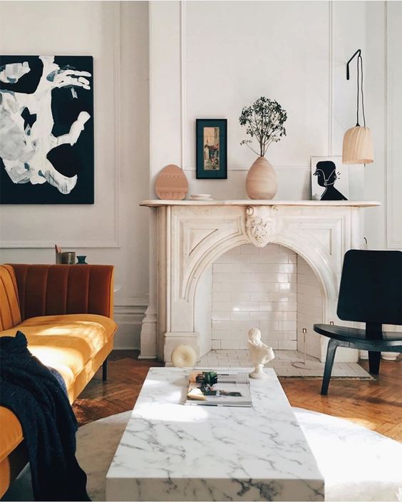
Lauren MacLean; Montreal
I stumbled across this image on Pinterest and upon digging, was shocked to believe it wasn’t in an interior designer’s portfolio! Lauren’s home appears small, but she has certainly made the most of her cozy space! The luxe mustard yellow velvet sofa paired with a stunning marble coffee table is so dreamy. The whole vibe is very Parisian and I’m swooning! I definitely had my eye out for accent lighting this week – as I’m also taken by her wall mounted pendant on above the fireplace to create a little reading nook. Such a creative use of space!
get the look


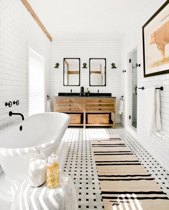
Timothy Godbold, North Haven 262
We are in the very early stages of starting our bathroom redesign, and so I’ve been on the hunt for some inspiration. This bathroom by Timothy Godbold has caught my eye multiple times during my search. I love the classic black and white tile floor (are we noticing a trend yet 😂) and subway tiled walls. I’m also very into natural wood vanities with room for storage baskets. The whole space feels very relaxing and will serve as major inspo when we go to remodel ours!


